Insights—Correlation of All Data Points
Here is a list of all the insights pages on the site.
Stats nerds out there, this one's for you. Using the epic visualization tool Seaborn, we plotted a heatmap of all factors' correlations.
If you're not familiar with correlation, it ranges from -100 to 100 (as a percentage) and expresses the extent to which variables are related to each other. For instance, if gas prices have a 90% correlation with electric vehicle demand, their correlation would be said to be very high, and we could expect higher gas prices to mean higher demand for EVs. If temperatures have a 10% correlation with stock market performance, the correlation would be said to be low, and any relationship observed would likely be coincidental. Correlation does not imply causation.
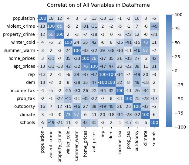
Here are a few interesting insights from the heatmap:
- Correlations aren't as high as one might expect: I was expecting near-100% correlation between home prices/apartment prices and violent crime/property crime. Though in the seventies, the correlation is not quite full, indicating some places where there is a large difference. Perhaps this can be the topic of a future post!
- Population isn't that highly correlated with anything: A reliable geographic stereotype is that of big cities having the highest levels of crime, as well as being significantly more expensive than smaller towns. However, there is no correlation in either direction greater than 20% between pouplation and any other factor.
- Warm places have more climate risk: One of the largest correlations in the dataset, nearly as large as home prices/apartment prices, is winter cold temperatures and climate risk. The blessing of warmer winter temperatures in places like Florida, Arizona, and Texas also comes with a curse: dangerously high summer temperatures, risk of fires, and/or flooding from rising sea levels.
- Violent crime's biggest correlation is with school quality:Besides property crime, by far the biggest association violent crime has is with school quality (49%). This is interesting because of the causality it potentially brings up—do good schools lead to higher incomes and fewer criminals? Or perhaps the low crime environment leads to a better place for kids to grow up and study. Causation is infamously difficult to pin down, but at any rate this is interesting.
- More temperate places are more expensive: This one isn't surprising either—more moderate weather, whether it be in winter or in summer, is strongly associated with higher prices of both homes and apartments. While infamously expensive and temperate California is a fair suspect, the correlations don't disappear when removing it from the list.
- Republican cities are cheaper than Democratic ones: For both homes and apartments, a striking disparity is noted. Pulling the numbers show this gap's extreme nature: the median home price in cities that voted 65+% for Joe Biden in 2020 was around $675,000, but only $350,000 in cities that voted for Trump. The respective mean apartment rental costs were $2300 and $1300.
Correlations are fun and all, but personalized recommendations are another! To find out what city to live in based on all of the factors explored here and even more, take our quiz!